New: Glassmorphism Meeting Room Display Theme!

We've added a new theme, available for all Meeting Room displays – Glassmorphism.
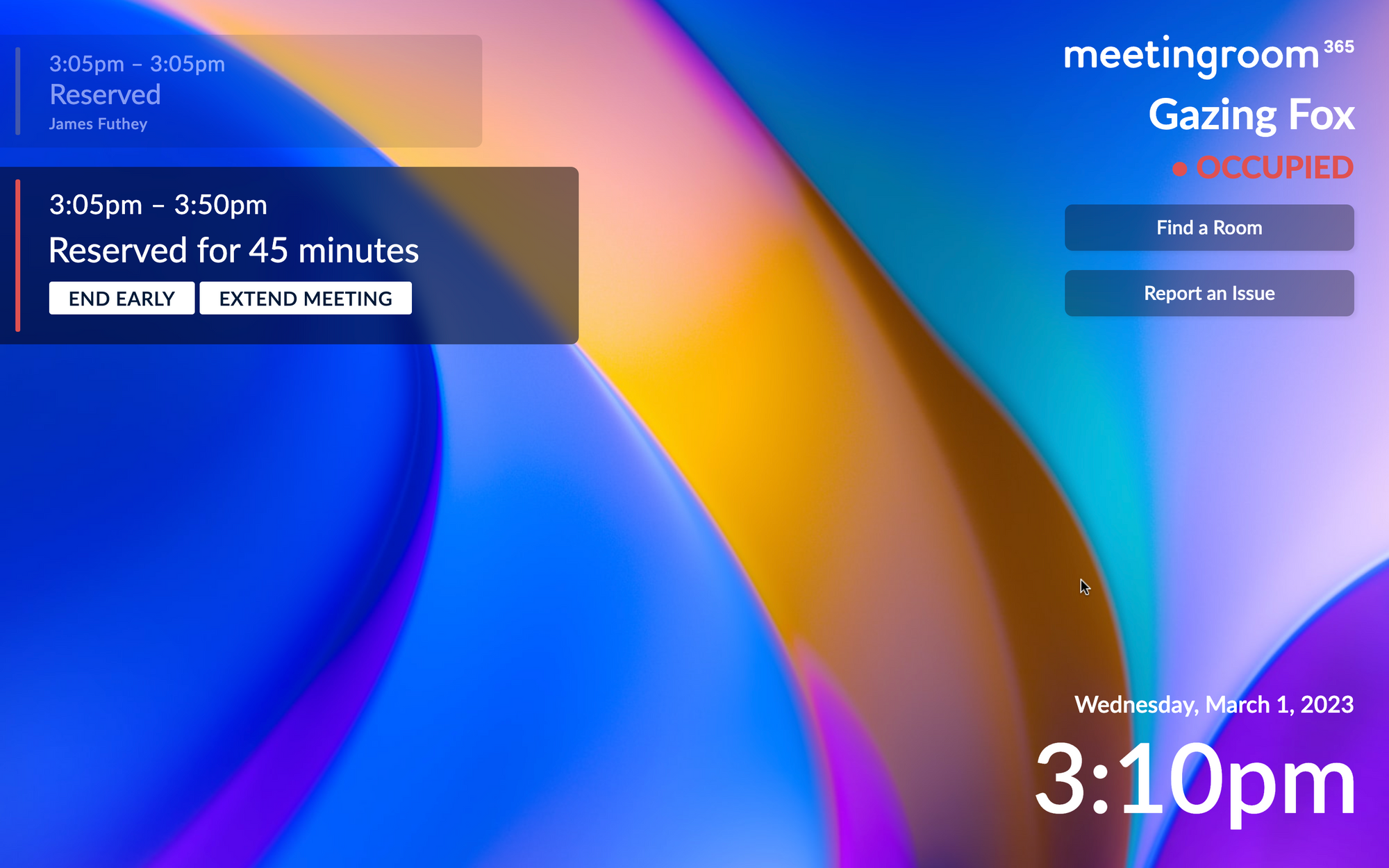
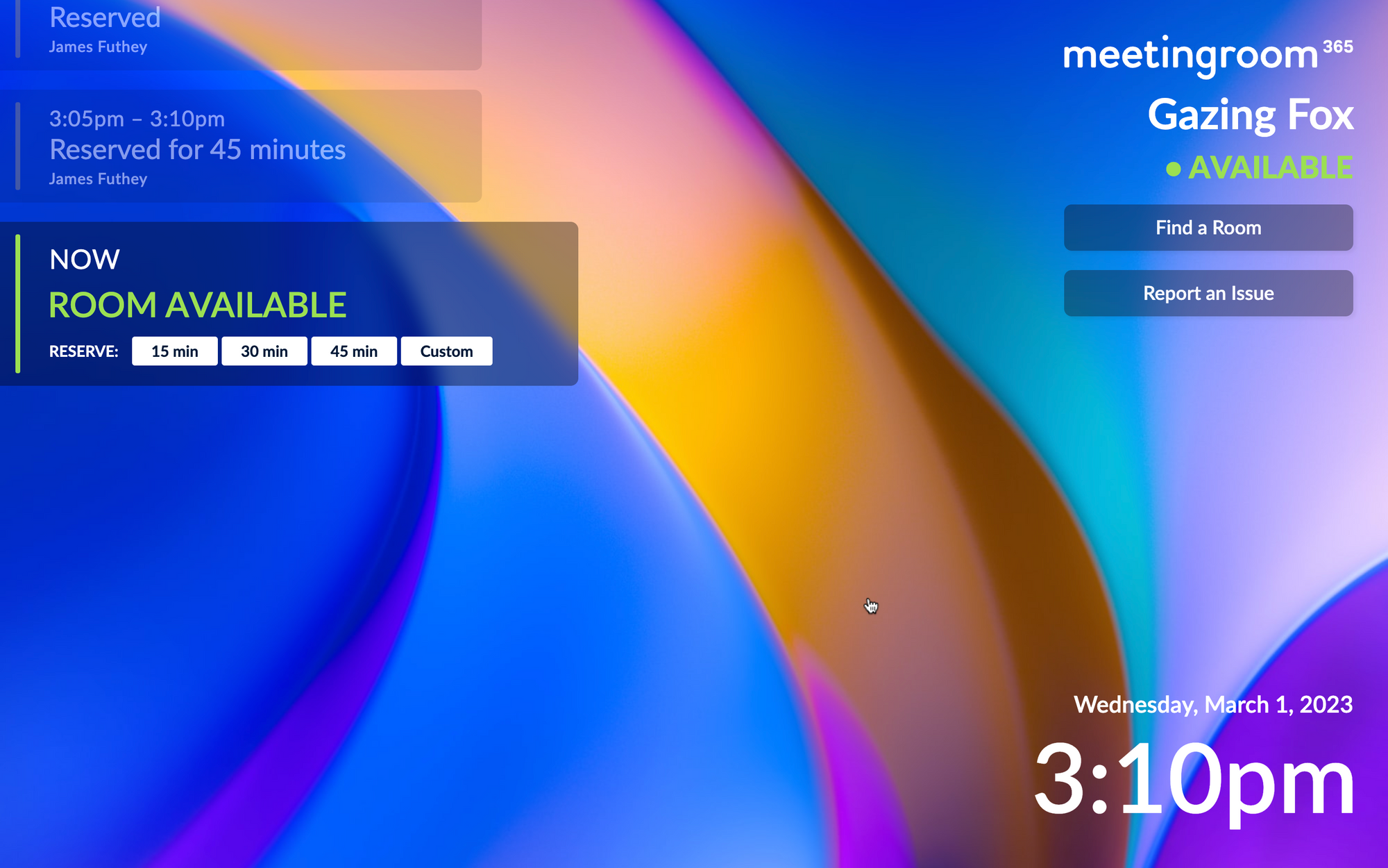
This includes a left and a right-aligned variant. Inspired by emerging UI trends, and the look-and-feel of Windows 11, and other software you may already be using, the Glassmorphism UI theme imitates the look-and-feel of frosted glass.
The Left-aligned Theme
This theme most closely resembes our existing v2 theme, but applies a Glassmorphism effect.


What is Glassmorphism?
Glassmorphism is a style that gives the impression of transparent or frosted glass. It creates a sense of depth and dimensionality, with UI elements appearing to float on top of a background. This is achieved through the use of blur, transparency, and color gradients, resulting in a sleek and modern look.
The Right-aligned Theme
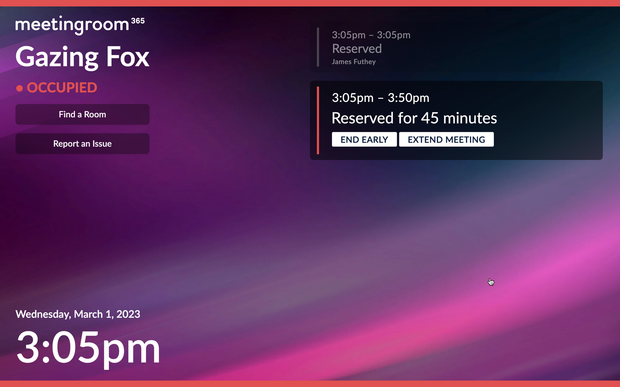
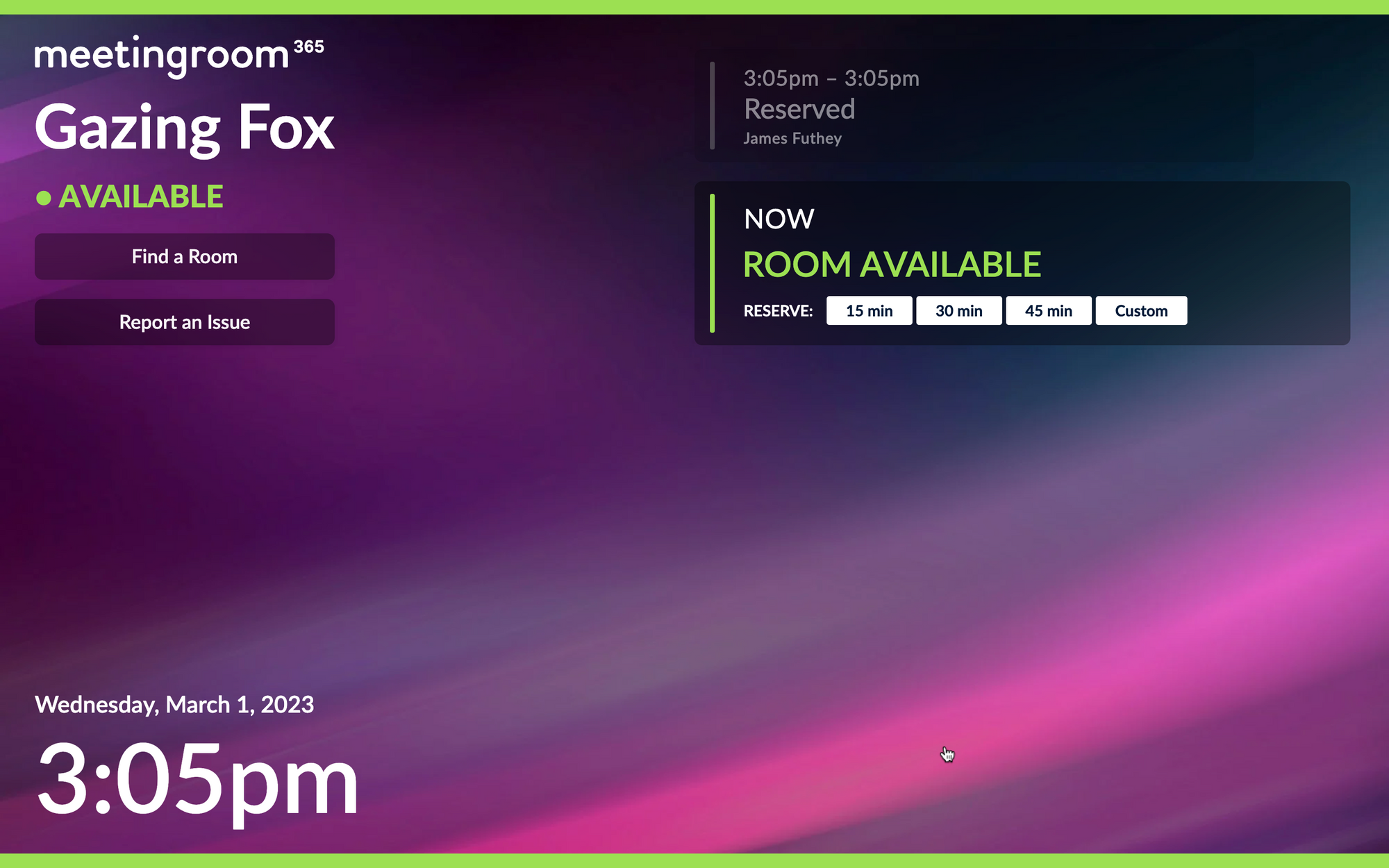
This is a right-aligned varient of the Glassmorphism theme. The only change is that it swaps meeting elements from the left to right side of the display.
For this demo, we've added status bars and switched the background.


Setup on your own displays
You can try these out today by replacing your custom CSS with the following:
Left-aligned Theme:
@import url("https://appstatic.mr365.co/glass.theme.css");
Right-aligned Theme:
@import url("https://appstatic.mr365.co/glass.right.theme.css");
Then, you can use any options in the v2 style editor to further customize your display.
More themes will be coming in the future. Let us know what you think!

